There are many uses for charts in Microsoft Word and knowing how to insert them properly is a good skill to know and master. In fact, there are the same number of charts available in word as there are in Excel. Let’s see how to create a chart in word so it can go in a document and look the way you want it to.

How Do Charts Start?
The first thing you need to have is a table that you want to get the information from. Have your information ready for you to input into the table. Alternatively, if you have the information you need in an excel file, that will work just as well. In fact, when creating a chart in Word you will be using a small part of an Excel file. I’ll explain more on this and you’ll understand this better in just a minute.
How to Create a Pie Chart in Microsoft Word
The first chart that we are going to create is a pie chart. Bear in mind though, that all charts are going to be created in the same way if you are starting from the Microsoft Word document itself.
- Navigate to the Insert tab on the Ribbon and select the Chart Button.

- The following screen appears:
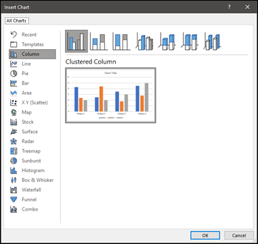
- Since we want to insert a pie chart navigate to the Pie Chart option and you will see the different Pie charts that are available to use.
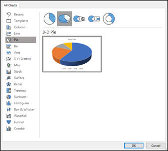
- You notice that there are two different parts to this pop up window. The top line shows you the basic styles that are on offer. Under that you see an example image. In fact, if you hover over the image, you’ll see that it becomes enlarged so you can see it with even more detail.
- Once you have selected the type of pie chart that you want, (I’m going with the3-D Pie) select OK.
- As you can see, there are two parts of the Pie chart that have appeared:
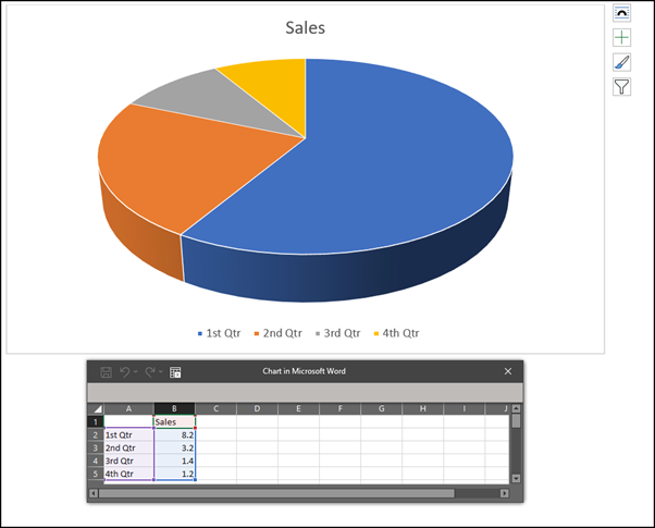
- The top is obviously the actual chart. Underneath that is actually an Excel file (widget) where you need to input the information that you want to appear in the chart.
- Here is my information that I want to input into the chart:
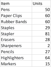
- Here is how the information looks, along with the Pie Chart, after I have inserted it into the table:
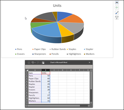
- Close the table and you will be left with the Pie Chart.
And that’s how to create a chart in Microsoft Word. But obviously that isn’t where we want to end this chart and we want to add some styling and see what else we can do with this chart.
Editing the Information on the Chart
Now that we have the basic chart, we need to edit it to ensure it has the look we want. We’ll go through the different sections of the chart one by one.
To Add or Edit the Title of the Chart
You can just double click on the actual words of the title and this enables you to edit the text. However, if you want to change the way it looks you are better off doing the following:
Click anywhere on the chart and in the Chart Design tab on the ribbon, select the Add Chart Element button and then select the Chart Title option:
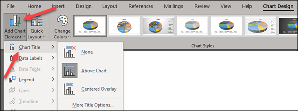
There are two options of how you want the title to show if at all. They are not the same in terms of size so it’s worthwhile looking at them.
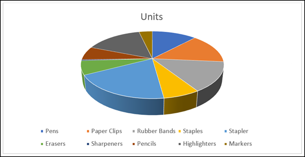
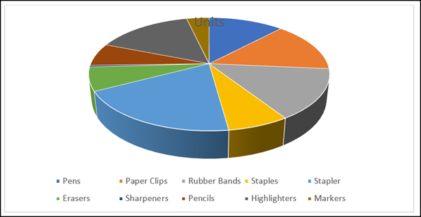
In the above chart you will see that the title cuts into the space of the chart. This isn’t true in the case of Centered Overlay:
As you can see, the chart with the Centered Overlay is actually bigger, even though the size of the chart has been increased. However, the actual title can be moved around the chart so you can actually place it where you want. This means that in truth, the big difference between the two options is the actual size of the chart.
Adding Text Effects to the Title
Once you have the title selected, you will be able to style it however you want. When you double click the title, you should a margin appear on the right side of your page. If it doesn’t, click on the Format tab in the ribbon and then select Chart Title and then Format Selection from the menu:

The following will appear on the right-hand side of your window:
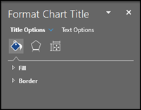
I would suggest to just go through the different options that are available here. There are lots of different ones and they are pretty easy to use and understand. If you need some help though, don’t hesitate to let me know in the comments.
Color Palates
Along with the actual colors that are there by default, there are also a number of different options for the colors so that they all fit together nicely.
Method #1
- Select the chart and then navigate to the Chart Design tab in the Ribbon.
- Select the Change Colors button:
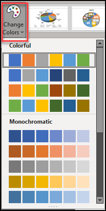
- Select the color palate that you like. You can hover over each of them and see how they look on your live chart before actually selecting the one that you want.
Method #2
- Select the chart by clicking on it. You will see the following little option box appear on the right side of the chart:
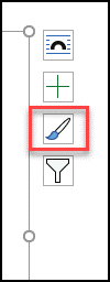
- Select the paintbrush icon – called Chart Styles.
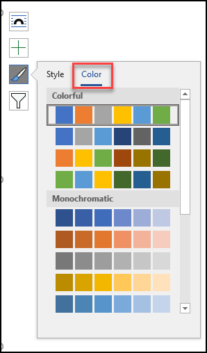
- You will see the different color palates. As before, hovering allows you to see a preview of how they look on your chart.
Changing the Color to Your Style
If you don’t like any of the color palates you can change the individual colors of the pieces of pie. To do so use the following method:
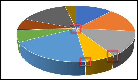
- Double click on the piece of the pie that you want to change the color and then right click it. Ensure that you only have that particular piece selected. You should see that the corners of the piece that you have selected have little circles on:
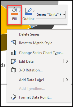
- On the menu, select the Fill option
- On the pop up screen , you will see the different options:
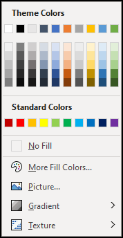
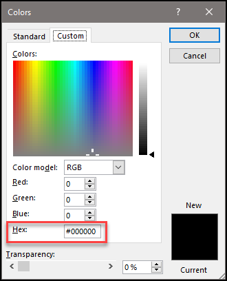
- If you have something very specific in mind, select the More Fill Colors option where you can put in the RGB numbers or the Hex Code.
Moving A Chart Around a Document
You don’t just want your chart just sitting there. You want to be able to move it around and put it in line with your text. Just remember that a chart acts the same way that an image or picture does. Just like you move your images around the document you do the same with a chart.
Select the chart by right clicking it and then selecting the Wrap Text button:
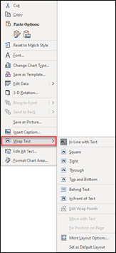
For the complete lowdown on what each of these options does, please see my blog post about Text boxes as they work in the same way.
Other Styles to Use in a Chart
I’m sure you noticed that when the chart is selected you see the ribbon on top with many styles, just as you do on a normal document with the Styles on the home tab that affect the text.
It’s a little funny to notice this and point this out now and I guess it’s some kind of option that Microsoft didn’t want to make available from the outset.
When creating a chart for the first time, all you see are a few options:
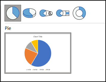
However, when you actually have the chart on a live document, there are many more available to you. The reason is because the styles are just different interpretations of the chart you have selected. For example, since I chose to do a 3D pie chart, I have style options relating to this specific chart.
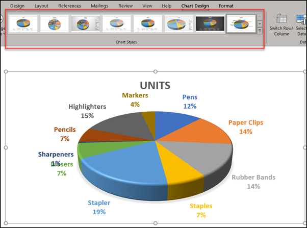
As you can see, all the options here are just variations on a theme.
Changing a Chart to a Different One
Once you have created one chart, you are not limited to only having this one shown. If you don’t like the way it looks it’s easy to change to a different one. For example, let’s say you want to create a column chart in Word and you already have a pie chart with the data on it. Let’s go through the steps you need to change it.
How to Create a Column Chart in Word
Since we already have the data I’m going to simply convert the existing pie chart into a Column chart.
- Select the chart and navigate to the Chart Design tab on the Ribbon
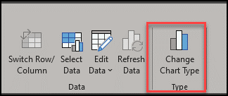
- If you are working with a 3D chart, such as the Pie chart shown here you will see the following screen:

There is nothing to worry about here though as we are going to change it to a completely different chart and will be able to style it however we want. Moreover, there is always undo if something doesn’t go the way you want. Select Change Chart and you will see the select box come up again.
- As before, select the chart that you want to show the data in and then select OK.
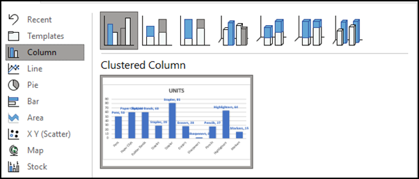
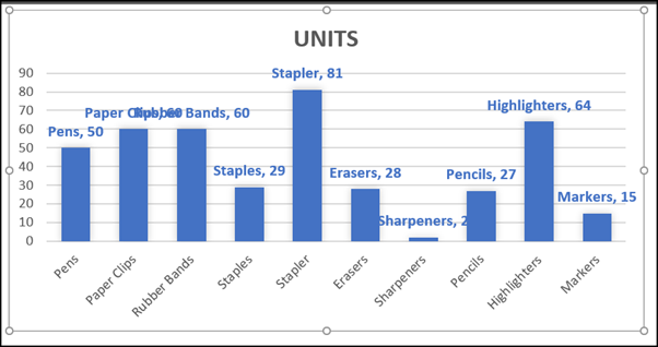
- This is what I came up with and it doesn’t look great so we’ll have to style it.
Styling Your Column Chart in Word
I think what I would like to do here is to remove the words (data labels) on top of the columns but keep the actual numbers (data values).
To Remove the Data Labels do the Following
- Double click on the actual data and you will see a toolbar appear on the right of your screen:
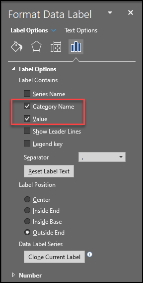
- Simply remove the check on the Category Name and the data label is removed:
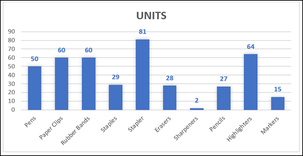
- Easy peasy!
Obviously now we don’t really need the y axis numbered so I’m going to make the Chart a little more attractive by selecting a different one in the Styles.
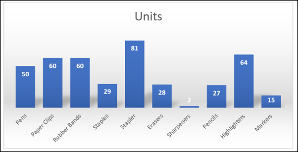
This is the one I’ve chosen. What do you think about it?
Resizing a Chart in Microsoft Word
The last thing to talk about is how to resize a chart. As the chart is constantly refreshing, you won’t find that the chart gets too out of shape like you find with images and pictures. However there are many different ways to resize a chart. I’m going to go through just two of them and they involve using the mouse.
Resizing a Chart Keeping Aspect Ratio
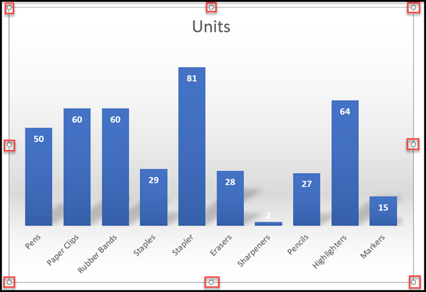
- Select the chart by clicking on it. You will see that there are now dots on the four corners as well as in the middle of the lines:
- Click on any of the corner circles and hold down the Ctrl key on your keyboard.
- Resize the chart to whatever you require. The chart will keep the same aspect ratio as you are holding down the Ctrl key on your keyboard.
Resizing a Chart to a Different Size
- As before, click on the chart to bring up your eight little circles.
- The ones in the corners allow you to resize your chart both up and down and left and right.
- The ones in the middle of the lines only allow you to resize your chart in that direction alone.
In Summary
Charts in Word are great tools and, once you get the hang of it, are pretty easy to use and manipulate. I hope you have enjoyed learning about them and as always, if you have any questions, just let me know and I’ll do my best to get you the answer you want to hear!
